Have you ever tried reading a restaurant menu on your phone, only to pinch-and-zoom through tiny text while your coffee grows cold? I’ve been there too—frustrated by clunky layouts that treat mobile users like afterthoughts. That sinking feeling when a site works on your device but doesn’t feel right? It’s why 57% of Americans refuse to recommend businesses with poorly optimized mobile experiences.
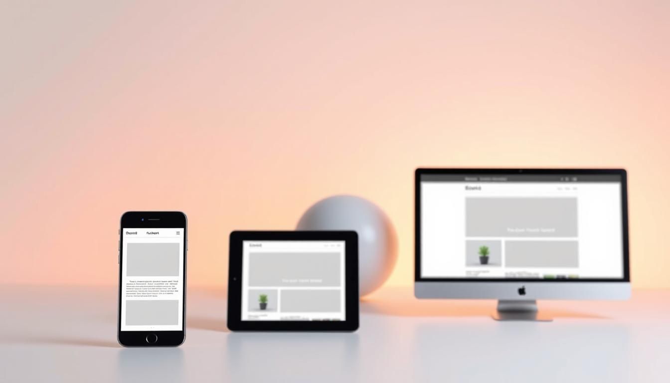
Modern audiences demand seamless interactions across every screen. With mobile devices driving 53% of global traffic, your digital presence must adapt like water—shaping itself to smartphones, tablets, and desktops effortlessly. Google recognized this shift in 2015 by making mobile-friendliness a key ranking factor, creating a make-or-break moment for businesses.
This isn’t just about aesthetics. It’s about survival in a world where users judge credibility in milliseconds. Fluid grids and flexible images aren’t technical jargon—they’re tools to keep visitors engaged, whether they’re scrolling during their commute or browsing at home. Let’s explore how smart design choices create dynamic experiences that grow with your audience.
Key Takeaways
- Mobile devices generate over half of all web traffic globally
- Google prioritizes mobile-friendly sites in search rankings
- 57% of users avoid recommending businesses with poor mobile experiences
- Fluid layouts automatically adjust content for different screen sizes
- Flexible media ensures images load correctly on any device
- Consistent user experience builds brand trust and credibility
Introduction to Responsive Website Development
Imagine your favorite shirt—it fits perfectly whether you’re at a desk or on a hike. That’s how digital content should work. In a world where screens range from smartwatches to 4K monitors, your online presence needs to stretch and shrink like elastic.
What Is Responsive Web Design?
This approach uses flexible layouts that rearrange elements based on screen size. Unlike older methods requiring separate mobile and desktop versions, it serves one HTML file adjusted through CSS. Think of it like water—pouring into any container without spilling.

Adaptive design creates distinct sites for different devices. Responsive solutions simplify updates and reduce costs. You’re not managing three websites—just one that works everywhere.
Why Adaptability Matters Now
People check recipes on phones during lunch breaks and shop on tablets at night. 73% switch devices mid-task, expecting seamless transitions. If your content fights their screen, they’ll leave faster than a dropped call.
Search engines reward adaptable sites. Users share smooth experiences. Brands save time by avoiding device-specific fixes. It’s not just convenience—it’s meeting expectations in a multi-screen world.
Understanding the Importance of Responsive Design
Like a broken zipper on your favorite jacket, digital experiences that don’t adapt create frustration. With mobile devices driving 51% of web traffic, your online presence must work smoothly across screens. This isn’t just technical polish—it’s the difference between keeping visitors or watching them vanish.

User Experience and Conversion Benefits
When pages load fast and menus fit your screen, people stay. Sites that load in 2 seconds keep 91% of visitors engaged. Wait 3 more seconds? Over a third leave. Smooth interactions turn casual browsers into buyers.
| Load Time | Bounce Rate | Conversion Impact |
|---|---|---|
| 2 seconds | 9% | High engagement |
| 5 seconds | 38% | Massive drop-off |
Simple design choices—like touch-friendly buttons—boost form completions by 34%. Users reward frictionless experiences with loyalty and purchases.
SEO and Mobile-First Rankings
Google’s search algorithm now prioritizes mobile-ready pages. Sites optimized for smaller screens climb rankings faster, capturing 67% of click-throughs on search results. Mobile ad spending ($91.5B in 2023) follows this traffic, making adaptability essential for visibility.
Every second counts. A well-structured page doesn’t just look good—it becomes a revenue engine. Design that bends without breaking keeps your audience hooked, no matter their device.
Key Principles Behind Responsive Website Development
Think of digital content as building blocks that rearrange themselves. Whether someone views your page on a 4-inch phone or a 27-inch monitor, every component needs to find its perfect spot. This magic happens through two core concepts: proportional scaling and smart media handling.
Fluid Grids and Flexible Layouts
Traditional designs use rigid pixel measurements—like building a bookshelf that only fits one room. Fluid grids work differently. They define elements using percentages relative to their container. A column might occupy 25% of the parent element’s width, whether that container is 300px or 1200px wide.
This approach ensures text wraps naturally, buttons stay tappable, and forms remain usable. Designers set minimum and maximum widths to prevent elements from becoming unreadably small or awkwardly stretched. It’s like having an elastic band that stretches just enough—but never snaps.
Responsive Images and Multimedia
High-resolution photos can slow down mobile users or distort layouts. Modern solutions use:
- CSS max-width: 100% to prevent images from overflowing containers
- HTML’s srcset attribute to serve smaller files to phones
- Art direction techniques that crop or focus images differently per device
A desktop hero image might show a wide landscape, while mobile displays a zoomed-in focal point. Videos embed in flexible wrappers that maintain aspect ratios during resizing. These tweaks keep pages fast and visually cohesive across devices.
By combining fluid grids with adaptive media, you create experiences that feel custom-made for every screen—without maintaining separate designs. It’s not magic; it’s mathematics meeting creativity.
Mastering Media Queries and Breakpoints
Like traffic lights guiding cars through intersections, media queries direct how content flows across screens. These CSS tools act as conditional instructions, checking a device’s capabilities before deciding how to display your layout. They’re the secret sauce that makes designs shift gracefully from phones to desktops.

Using CSS Media Queries for Dynamic Layouts
Think of media queries as “if-then” statements for your design. When a screen meets specific conditions—like being wider than 768px—the CSS applies tailored styles. For example:
@media (min-width: 992px) {
  .sidebar { width: 25%; }
}
This code only activates on laptop-sized screens. You can target orientation, resolution, or even print formats. The key? Write queries that adapt your content—not just shrink it.
Common Breakpoints for Devices
While screens vary, these ranges cover most devices:
| Device Category | Breakpoint Range | Common Use |
|---|---|---|
| Phones | 0-576px | Vertical scrolling |
| Tablets | 577-768px | Two-column layouts |
| Laptops | 769-1200px | Sidebars + main content |
| Desktops | 1201px+ | Widescreen displays |
Bootstrap’s framework uses similar thresholds. Start with these, then adjust based on your analytics. Test layouts in both portrait and landscape modes—23% of users rotate devices while browsing.
Implementing Responsive Typography and CSS Techniques
Like a perfectly balanced meal where every ingredient complements the others, typography and layout systems work together to create satisfying digital experiences. Get these elements right, and your content becomes deliciously readable across devices.
Choosing the Right Fonts and Sizes
Fixed pixel measurements crumble like stale bread in multi-device environments. Modern solutions use relative units like rem that scale with screen dimensions. One rem equals the root font size (usually 16px), letting text grow proportionally without distortion.
Pair line heights with viewport units for dynamic spacing. A 1.5rem font might use 2vw line height—tight on phones, airy on desktops. Avoid ultra-thin fonts for mobile users battling sunlight glare.
Integrating CSS Grid and Flexbox Methods
Flexbox handles single-axis layouts like navigation bars. Need items to wrap when space tightens? Try:
.container {
  display: flex;
  flex-wrap: wrap;
}
CSS Grid shines for complex magazine-style layouts. Define columns that shift from 4-wide on desktops to single stacks on phones. Both systems adapt to content length automatically—no more awkward empty spaces.
These techniques create designs that breathe with the screen. Text remains sharp, layouts stay intuitive, and users never feel trapped in a rigid framework.
Step-by-Step Responsive Website Development
Building a digital experience is like constructing a house—start with a strong foundation before adding rooms. Mobile-first design works the same way. Begin with core content that fits small screens, then expand features as space allows.
Planning Your Design With Mobile-First Strategy
Start by sketching a single-column layout for phones. Focus on:
- Essential text and buttons
- Readable font sizes (16px minimum)
- Touch-friendly spacing between elements
This approach forces prioritization. You’re not removing features from desktop—you’re building upward like adding floors to a skyscraper.
Setting Up Media Query Ranges and Fluid Units
Once mobile styles are set, use CSS like this:
@media (min-width: 768px) {
  .container {
    width: 90%;
    max-width: 1200px;
  }
}
Key tips:
- Use percentages instead of fixed pixels
- Set breakpoints at 768px (tablets) and 992px (desktops)
- Test on real mobile devices during development
This method creates smooth transitions between screen sizes. Elements grow proportionally, avoiding sudden layout jumps. Your design adapts like clay—molding to any device while keeping its shape.
Optimizing Images and Content for Multiple Screen Sizes
Picture a chameleon changing colors to match its surroundings—your visuals should adapt just as smoothly across devices. While basic CSS scaling makes photos fit containers, it forces mobile users to download desktop-sized files. 53% of visitors abandon sites that take over 3 seconds to load, making smart image handling non-negotiable.
Best Practices for Responsive Images
Swap static width rules for HTML’s srcset attribute. This lets browsers choose smaller files for phones and hi-res versions for 4K monitors. For example:
<img src="small.jpg"
     srcset="medium.jpg 1000w, large.jpg 2000w"
     alt="Adaptive product photo">
WordPress automates this process when you upload media. Platforms like Shopify use similar logic, serving 40-60% smaller files to mobile shoppers. Pair this with the <picture> element for art-directed crops that highlight key details on compact screens.
Organize content like a newspaper editor—prioritize headlines and calls-to-action for small displays. Save secondary details for wider layouts. Compress PNGs to WebP format for 30% faster loads without quality loss. As designer Sarah Winters notes: “Treat every pixel like prime real estate—use it wisely or lose your audience.”
Responsive Website Development Tools and Frameworks
Think of modern web design tools like a Swiss Army knife—versatile solutions that handle multiple challenges at once. The right framework lets developers create polished layouts faster while maintaining consistency across devices. With 72% of users expecting seamless mobile experiences, these resources have become essential.
Popular Frameworks: Precision Meets Flexibility
Bootstrap remains a go-to for its ready-made components and 12-column grid system. Need more customization? Foundation offers modular flexibility with mobile-first breakpoints. For those who prefer crafting unique styles, Tailwind CSS provides utility classes that streamline code without rigid templates.
CMS Platforms: Powering Dynamic Experiences
WordPress simplifies responsive design with themes that adapt to any screen. Its built-in image optimization serves appropriately sized files automatically—a game-changer for mobile performance. Over 43% of websites use this platform, proving its value for both developers and content creators.
Alternative tools like Bulma (Flexbox-based) and Materialize (Google-inspired) offer fresh approaches. Whether building a blog or complex site, these frameworks reduce repetitive code while keeping designs crisp across devices. Choose tools that align with your project’s scale—and watch efficiency soar.
Useful Resources
For additional insights, check out these valuable resources:
- web development documentation - MDN
- web development tutorials - W3Schools
- CSS and frontend tips - CSS-Tricks
- modern web development - Google Developers
- web design and development - Smashing Magazine
FAQ
How does adaptable design improve user experience?
Adaptable layouts automatically adjust elements like text, images, and menus to fit any screen, ensuring smooth navigation on phones, tablets, or desktops. This reduces zooming or scrolling, keeping visitors engaged.
Why do search engines prioritize mobile-friendly pages?
Google and others rank sites higher if they load quickly and display properly on smaller screens. Mobile-first indexing means your content must perform well on handheld devices to boost visibility.
What tools help create flexible layouts?
CSS Grid and Flexbox let developers build dynamic structures that resize based on available space. Frameworks like Bootstrap offer pre-built components optimized for different viewports.
How do media queries adjust content for tablets vs. desktops?
Media queries apply specific styles when a device’s width matches predefined breakpoints. For example, a three-column desktop layout might switch to a single column on phones using max-width: 768px.
What’s the best way to handle images on varying screens?
Use the srcset attribute to serve smaller files for mobile users. CSS properties like object-fit: cover ensure images scale without distortion, maintaining visual appeal across devices.
Can platforms like WordPress support adaptable designs?
Yes! Themes like Astra or Divi include built-in options for fluid grids and breakpoints. Plugins such as WPTouch further optimize sites for touchscreens and faster load times.
Why start with a mobile-first approach?
Designing for smaller screens first forces prioritization of essential content. It’s easier to expand features for larger displays than to cram desktop elements into cramped spaces.
How do typography choices impact adaptability?
Relative units like rem or vw let text scale with screen width. Sans-serif fonts like Open Sans enhance readability on low-resolution displays while keeping styles consistent.